

For clients / Reviewing
Review a plan on a phone
How a plan looks on a phone: its pages in one column, photos you can swipe through, and comments in a sheet.
On a screen narrower than 768 pixels, a plan shows its pages one under the other in a single column, and you scroll through them freely. Everything else works as on a computer: you approve, suggest a caption, choose a grid and comment the same way. See Review a plan.
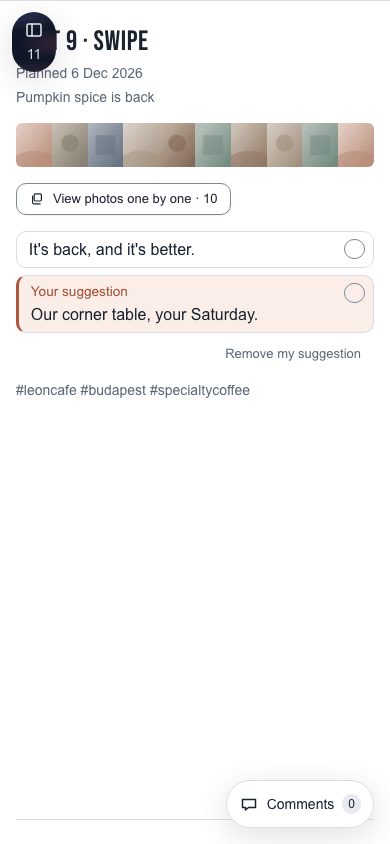
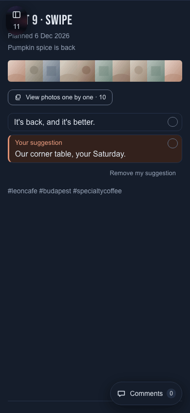
A post's page
Each post or story shows its title, planned date, topic, photos and videos, captions and, on a post, hashtags, in that order. How the photos show depends on how many there are:
| Photos | What you see |
|---|---|
| One | The photo fills the width of the screen. |
| Two or three | A row you slide sideways. |
| Four or more | A strip of all of them, with View photos one by one below it. A story shows them as a row instead. |
View photos one by one shows each photo the full width of the screen, with a counter such as "3 / 10". Swipe sideways or use the arrow buttons to move through them, and select the close button to go back. Tapping a photo of a swipe opens the same view at that photo.
A video shows its poster and a round play button. A single video, a reel or a story's video plays in place at the full width when you tap the button, with sound and the player's controls. In a swipe, tapping a video opens the one-by-one view at that video, which plays it.
Comments
The Comments button at the bottom right shows how many comments the page has. Tap it to open the comments as a sheet from the bottom of the screen. Close it with its close button, or tap the plan above it.
The pages menu
The button at the top left shows which page you are on and opens the pages menu. On a phone the menu fills the width of the screen and closes as soon as you pick a page.